

A Summer's Work... Redesigning WIT's Tutors Open Source Software Using DaisyUI


During the summer, I tasked myself with redesigning the Tutors course reader software, built by Eamonn de Leaster for Waterford Institute of Technology. This software is used to deliver many of WIT's online courses to students across Ireland.
Tutors-Next (the current iteration) is a Svelte & Typescript application which consumes JSON output from tutors-json and renders an interactive experience for students. The application identifies the published course from a url, recovers the JSON version of the static site and then renders a Svelte application.
Previous iterations of Tutors were a static site generator, which was succeeded by an aurelia reader app, and has progressed into the current Svelte reader. These last two are supported by a generator, which produces a type of headless version of a course.
The original interface was created based on Semantic UI, succeeded by UI kit and then replaced to use Tailwind CSS. After plenty of research, it was decided that the redesign would go ahead using the DaisyUI Tailwind components. These components were selected as they are functional, customizable components that suit perfectly to this use case.
Below, you can see the redesign and an explanation of each page's design choice.
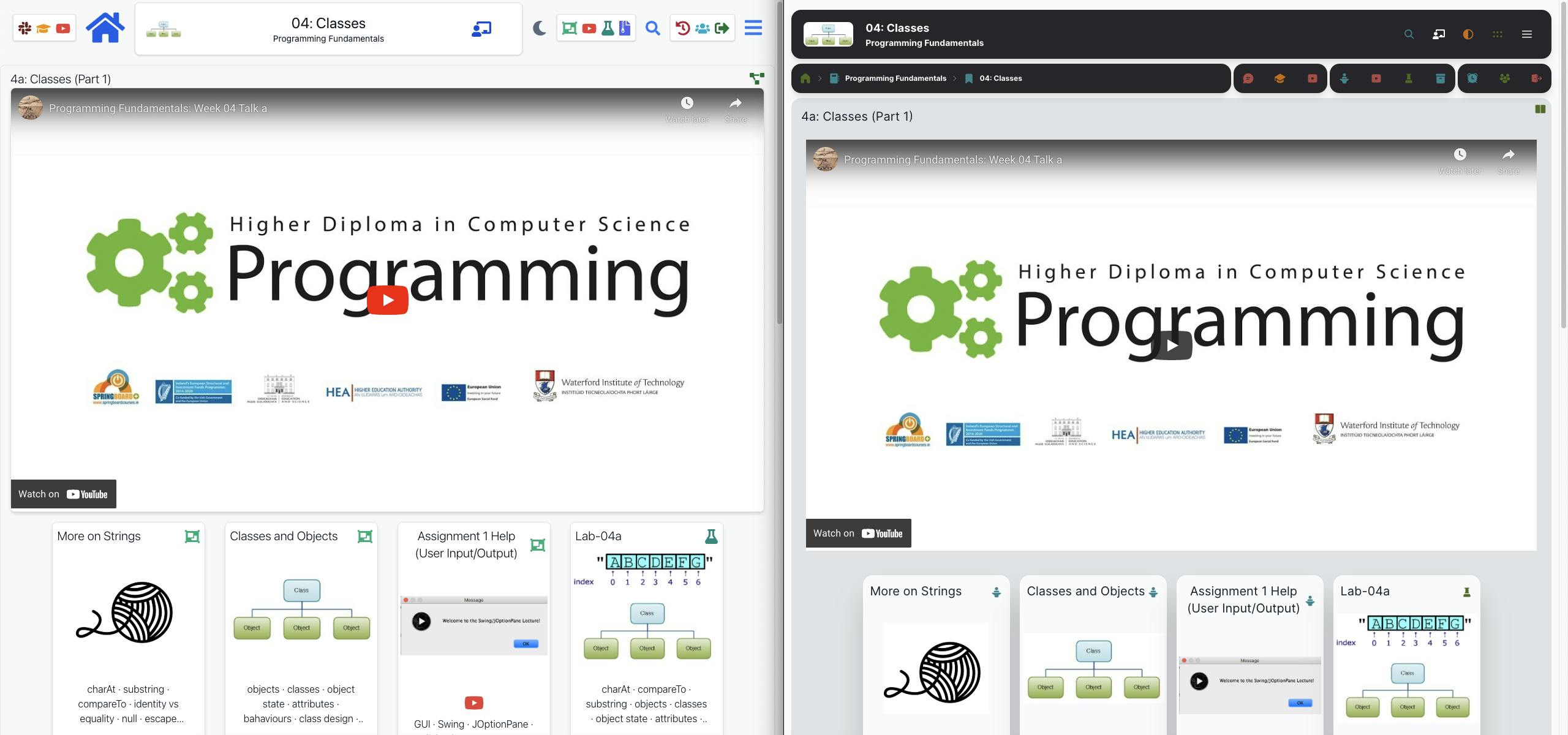
Homepage
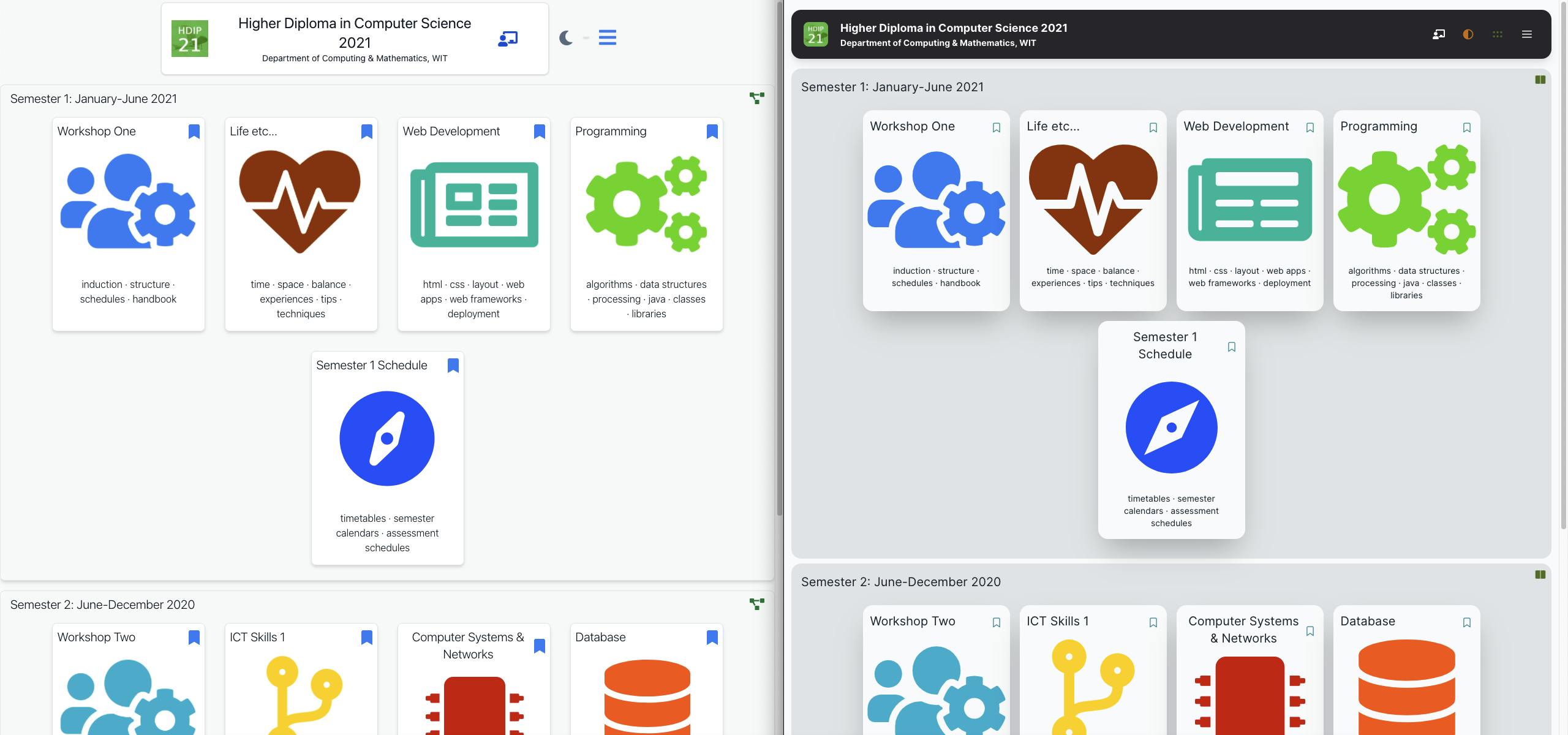
The first, most obvious change on the homepage is the navigation bar. The idea of this is to declutter the mixture of top sections, particularly at a deeper level of viewing modules & topics, and combine everything into a neat section for navigation. The course image and information text was moved & aligned to the left of the navigation bar for uniformity across all areas of the page. The icons to the right of the main navigation bar depict the Tutors version number, a theme switcher, a compressed/expanded view switcher & a table of contents button. This navigation bar is also sticky on desktop view, so is always visible and usable.
Next, the course contents was split up to more obviously show each semester, with a different background and a lighter drop shadow added. The cards for each module were also updated with a lighter, longer drop shadow. The icons on the cards were also updated to accept SVG icons from the iconify framework aswell as the screenshots of icons used by the original.
The font across the whole site was also updated to use the Inter typeface family.
Dark Mode & Theme Switcher
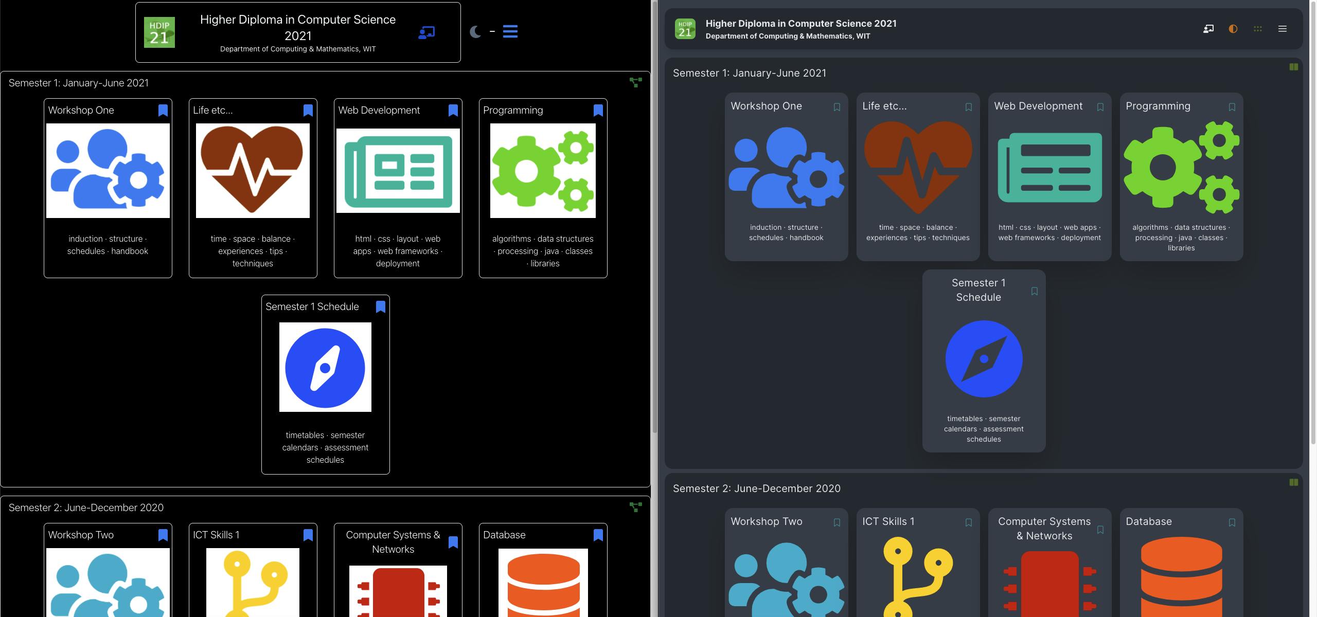
The dark mode design was also updated to use DaisyUI's soft shades of blue instead of solid black, to be easier on the eye. Here, you can also notice the difference in using SVG images instead of screenshots.
In the original Tutors design, the dark mode button was just used to switch between dark mode & light mode. With the new design, this if a theme switcher with a dropdown with a choice of many themes. This was implemented using theme-change.
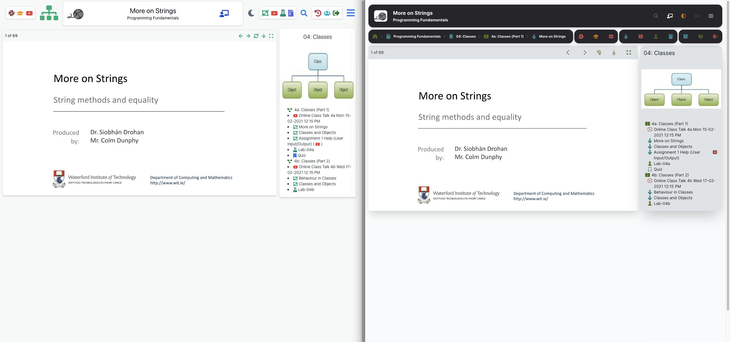
Module View & Breadcrumb navigation
As we go into module view, you can now see the lower-level cluttered menu of the original design. A new secondary navigation bar also displays, with a breadcrumb navigation - which give visibility on where you are on the course. This is a huge improvement from the original's "go back to previous page" button, which needed multiple presses to go to the homepage.
Beside this breadcrumb navigation you can see the icon sections for companion sites, course resource shortcuts & additional tutors features. These are all organised and displayed in a row, making navigation more intuitive than previous. The cards are also redesigned with the same softer shadow as used on the homepage.
Topic View
The topic view has been updated with more padding for visibility of the topic titles, a larger video card on smaller displays (along with resizing to be smaller for larger displays), and the same soft drop shadow on the cards for uniformity. The background of each section is also broken up to be clearer for the student to view.
Talk View
The talk view has had minor improvements for usability. On the left is a PDF presentation, and I have changed the navigation icons to have more padding for easier pressing on touch devices. The right hand navigation gives visibility of the course topics, for students to navigate the the next talk, lab or video easily. This was functional as-is, so this was kept with minor design updates.
Lab View
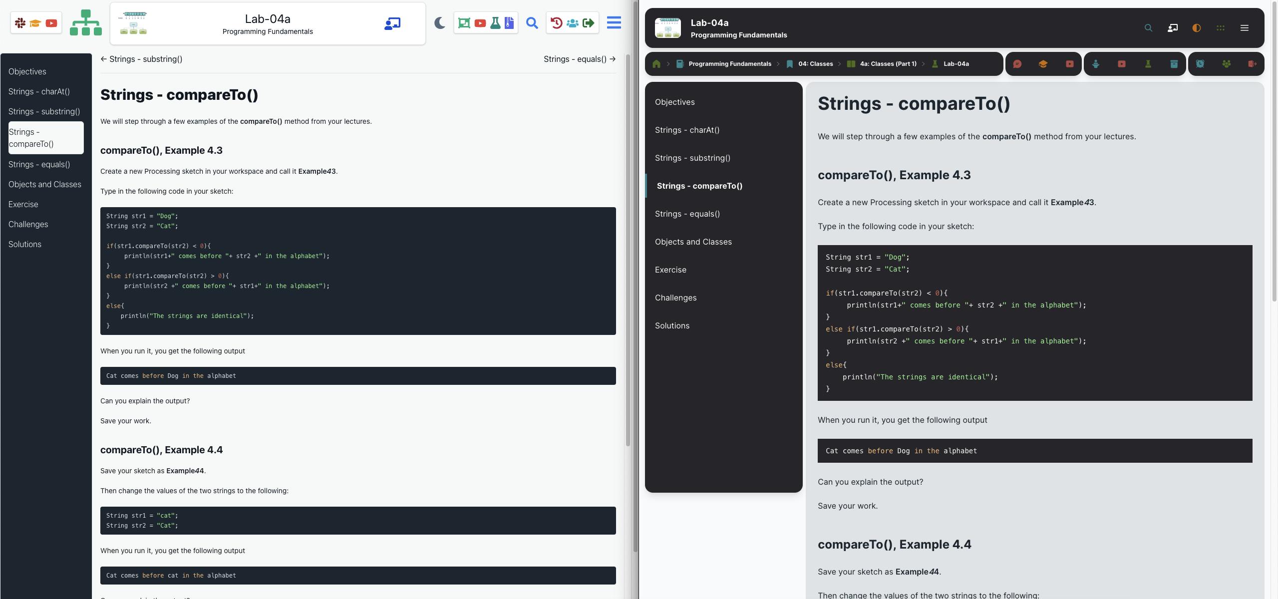
The lab view has been redesigned with clearer sections in mind, using a left hand fixed navigation to change between lab steps, and a scrollable lab on the right, made clearer with a light card background. The active lab step has been highlighted with a left border and using bolder text, instead of the background change in the old UI.
Mobile View
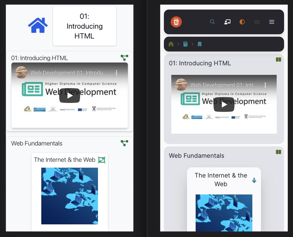
This redesign was also done with mobile users in mind, for students looking to digest course content and study on-the-go. As you can see from the above image, the mobile interface has been vastly improved with better navigation, clearer sections and more functionality.
All in all, I am proud of the work I have put into this redesign of the Tutors software, and it has been a great learning experience for me to work on. I intend to further improve this software alongside Eamonn and, until Christmas, the developers RedHat have kindly gave to us to lend a hand.